Google fonts are awesome! Leave it to Google, the guys who make it possible to find instant answers to every question we have, to come up with a way to allow everyone, including designers, developers, small business owners and hobbyists to have an amazing resource of fonts available to them for free.
Google fonts are available to use anywhere you want them and anyway you want to use them. This means you can use them in print, on your computer, on websites, literally anywhere, and if you are handy you can even customize them for your own use or even collaborate with the original designer to make improvements.
There is one problem, with nearly 1000 fonts available, the choices can become a little overwhelming. So here are eight of our favorite Sans Serif Google fonts for you to check out.
1. Montserrat:

The old posters and signs found in the traditional Montserrat neighborhood of Buenos Aires were the inspiration that led Julieta Ulanovsky to design this typeface and rescue the beauty of urban typography that emerged in the first half of the twentieth century.
From Julieta, “As urban development changes this place, it will never return to its original form and loses forever the designs that are so special and unique. To draw the letters, I rely on examples of lettering in the urban space. Each selected example produces its own variants in length, width and height proportions, each adding to the Montserrat family. The old typographies and canopies are irretrievable when they are replaced.
There are other revivals, but those do not stay close to the originals. The letters that inspired this project have work, dedication, care, color, contrast, light and life, day and night! These are the types that make the city look so beautiful.”
2. Raleway:

This font is an elegant sans-serif typeface family. Initially designed by Matt McInerney as a single thin weight, it was expanded into a 9 weight family by Pablo Impallari and Rodrigo Fuenzalida in 2012 and iKerned by Igino Marini. We love this font for its readability. Our favorite letter is the “W”
3. Roboto:

Roboto has a dual nature. It has a mechanical skeleton and the forms are largely geometric. At the same time, the font features friendly and open curves. While some grotesks* distort their letterforms to force a rigid rhythm, Roboto doesn’t compromise, allowing letters to be settled into their natural width. This makes for a more natural reading rhythm more commonly found in humanist and serif types.
*What is a grotesque? The definition of a grotesque is a bit nuanced. From 30,000 feet, grotesque is used for sans serif fonts in general. More specifically, grotesque refers to the set of sans serif fonts produced around 1815. Sans serifs from this time period and the following few decades are called grotesque and also sometimes Grotesk or Gothic.
4. Red Hat Display:

Red Hat is a family of typefaces produced in 2 optical sizes, in a range of weights with italics. The fonts were originally commissioned by Paula Scher, Pentagram and designed by Jeremy Mickel, MCKL for the new Red Hat identity.It is now open sourced and available for everyone.
5. Lato:

Lato is a sans serif typeface family started in the summer of 2010 by Warsaw-based designer Łukasz Dziedzic (“Lato” means “Summer” in Polish). In December 2010 the Lato family was published under the Open Font License by his foundry tyPoland, with support from Google.
6. Open Sans:

Open Sans is a humanist sans serif typeface designed by Steve Matteson, Type Director of Ascender Corp. Open Sans was designed with an upright stress, open forms and a neutral, yet friendly appearance. It was optimized for print, web, and mobile interfaces, and has excellent legibility characteristics in its letterforms. <–That’s why we like it!
7. Rubik:

Rubik is a sans serif font family with slightly rounded corners designed by Philipp Hubert and Sebastian Fischer at Hubert & Fischer as part of the Chrome Cube Lab project.
8. PT Sans:

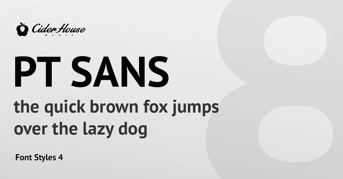
PT Sans is based on Russian sans serif types of the second part of the 20th century, but at the same time has distinctive features of contemporary humanistic designs. The family consists of 8 styles: 4 basic styles, 2 captions styles for small sizes, and 2 narrows styles for economic type setting. Designed by Alexandra Korolkova, Olga Umpeleva and Vladimir Yefimov and released by ParaType in 2009.


