Welcome to the new year. To kick it off, here are the 18 web design trends 2021 that we’ll be watching this year.
2020, we thought you’d never end…
At the risk of stating the obvious, 2020 wasn’t easy. We learned all about the ins and outs of hand sanitizer and how to use zoom like a pro. The year was full of uncertainty and struggle and all kinds of things unfamiliar. But through it all we learned to play musical instruments, new languages and how to cook. We took long walks, meditated, and welcomed new pets into our homes. We figured out a new way of life, how to cope and how to survive.
Businesses learned that they needed to get online and get online quickly. All the things that they have been ignoring couldn’t be ignored any longer. They needed to up their social media games, change the way they communicated with their clients and they needed a website that would showcase what they did in the year 2020.
For the team at Cider House, while all these things were true, thankfully we were still able to work, albeit from home. We got to see each other and share our ideas on the zoom conferences that we’ve all become so familiar with.
Through it all, we have managed to keep an eye on what might be coming up in 2021.
So to kick off this new year here is a list of the web design trends that we are watching for 2021.
1. Light and Muted Colors
We are going to see a lot of different and even opposing color trends this year. Over the past several months most of the world’s paint manufacturers have revealed their colors of the year. This year they seem to trend toward more neutral, earthy and desaturated colors. That isn’t to say that there aren’t bright saturated colors in the trends, but let’s face it, light and muted colors are a little easier on the eye. They can be relaxing and comforting. They can feel safe, familiar, and secure. Those are all things we can use in the coming year.
There is a reason that spas and wellness centers use lighter and more muted colors.
After the year we’ve just gone through we feel that bringing feelings of calm and familiar to website visitors might be a good choice. That’s why we feel that light and muted colors will be very popular in website design this year.

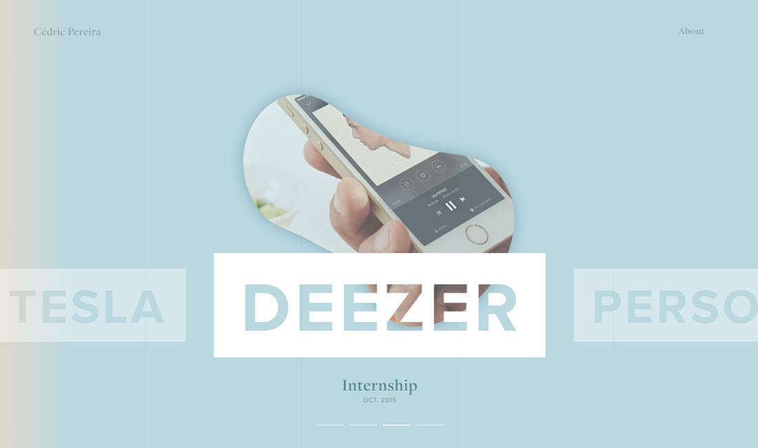


Examples (clockwise from top left): 1. The Dockyard Social 2 and 3: Cedric Pereira 4. Dropbox.Design
2. Future Leaning Retro Fonts
2020 was the year that the serif font made a comeback. These fonts feel traditional and trustworthy. The fonts we’re seeing aren’t the same fonts that we always see. What we are seeing is a more stylized and a reimagined concept of what these retro fonts can be. They’re bold and strong. They are traditional, but with a cool and modern update.
Nostalgia is still alive and well. Next year we will see more brands use modern feeling updates of the traditional fonts. They will be bold and curvy and minimalistic. They will bring warmth and familiarity. They will speak volumes.
Examples: 1. Blackpast 2. Alpha 3. Alectro 4. Averox
3. Horizontal Scrolling
Sometimes it’s fun to throw in a little something unexpected. Horizontal scrolling isn’t something that you see very often in traditional website design. This concept was reserved for artists and edgy trendsetters. As far as web design trends go, we love this one!
In 2021, we feel that horizontal scrolling can be a very good opportunity to move your story along.
Collectively, we have spent more time online and surfing the web this past year than any other year since the web became a thing.
Website audiences are frankly hipper and savvier. They are used to scrolling, generally speaking, so adding a horizontal scroll into the mix can be a good thing. Just don’t overuse it. It should be used thoughtfully. Like any other web content, it should help move your story forward. It should help make it clearer, not more confusing.
Our team always focuses on content first, so any element that we use on a website has to help move your website visitor toward the outcome you were looking for. Whether our goal is sending an email, clicking a link or signing up for an email list, any element should help guide your website visitor to this end.
Used in the right way, horizontal scrolling can be a great tool to accomplish this.


Examples (clockwise from top left) 1. Gosha Khidzhakadze 2. Polygon Design 3. Christie Tang 4. Patrick Heng
4. 3D Visuals
With higher resolution screens and faster Internet, 3-D designs have come a long way. We have been seeing 3-D designs moving into the mainstream more and more over the past year.
2021 will be a year that we continue to see 3-D being used in all kinds of ways. Combining 3-D objects with images, illustrations and 2-D designs, dding depth and even a little bit of reality.
We think that the use of 3-D elements on the website is going to inspire designers over the next year. The results can be amazing.


Examples (clockwise from top left) 1. Ya Ya 2. Paper Planes 3. Chronicled 4. Campo Alle Comete
5. Scrollytelling
What is scrollytelling? The term was first used to describe long-form online stories that were more than just text and images. They featured audio, video and animation effects that were all triggered by the visitor scrolling down the page. This format created a very different experience than reading a story online with little or no multimedia.
One early example of this was an online journey created for land rover called “the vanishing game.” In the first week, this online longform journey garnered 233 million media impressions. Too bad this isn’t available online any longer, but the good news is that there are others.
We believe that the story means everything. With 2020 being a year that all of us spent a whole lot more time in front of our screens, we feel the timing is perfect for brands, large and small, to use scrollytelling as a way to more deeply tell their stories.
Examples: 1. The Boat 2. Mission Jurassic 3. Think with Google 4. Bond 5. Inception 6. Poor Millenials 7. culture.pl
6. Dark Mode
There is a lot of hype swirling around dark mode. Our iPhones, Google Chrome, Instagram and Apple computers can switch to dark mode by using a simple toggle, although oftentimes with mixed result.
Long gone are the days of small white text on black backgrounds which gave original incarnations of dark mode a horrible flavor.
We feel designers are going to continue to explore the visual capabilities of dark mode with interesting color combinations and styles. And the bonus is that dark mode helps with your battery life and might actually be easier on the eyes.


Examples (clockwise from top left) 1. Arara 2. Tio Luchin 3. Alsace Wines 4. Kantar
7. CARTOON ILLUSTRATIONS
This is definitely one of our favorite web design trends. More and more, we have been seeing illustrations show up in web designs. These custom illustrations can certainly help tell your story and are a very cool way to help a website stand out from the pack.
Web illustrations have become more varied and are using many different styles and techniques. You can find illustrations on websites for businesses of all types, large and small. These illustrations are showing up as simple drawings, cartoon characters, and very detailed three-dimensional feeling illustrations.
We think that during 2021 we will be seeing custom illustrations being incorporated more and more on websites for all types of businesses.


Examples (clockwise from top left) 1. airbnb 2. Longshot Features 3. Mailchimp 4. Spotify
8. GEOMETRIC SHAPES
For years, designers have been playing with geometric shapes in their web designs. During this time, there has been a contest to see which is better: rounded-edged organic shapes or hard-edged geometric shapes. We think that all shapes are good.
Combinations of round and hard-edged geometric shapes (squares, triangles, trapezoids and polygons) are showing up on websites all across the web. Rounded organic pair nicely with sharp, pointed, straight-edged geometric shapes, just like a nice Cabernet and a block of aged cheddar.
Fun and playful 3D shapes, flat blocks and solid shapes in lots of colors will be taking center stage in 2021.


Examples (clockwise from top left) 1. Hike One 2. Swab the World 3. cworks 4. Future London Academy
9. CUSTOM CURSORS
One of the areas in website design that gets overlooked the most is the arrow-shaped cursor that we’re all used to seeing when we’re “surfing the web.“
More and more designers are including custom cursors in their website designs because it is a cool and playful element. And because we are not used to seeing custom cursors appear too often, it adds a little extra fun to the user’s experience.
We think this under-utilized design element will show up a lot more in 2021.


Examples (clockwise from top left) 1. Julia Guzal 2. Samuel Day 3. Castor & Pollux 4. Ivang Design
10. WEB DESIGN INSPIRED BY PRINT
At Cider House, the content guides our web design. So what do we mean by that? With a content-first approach we design for the content. We don’t try to jam a bunch of words into a preset template space.
We like to use magazines and print catalogs, as not only inspiration for our designs but also the inspiration for how we will present our copy on our websites.
As people are spending more and more time staring at their screens, we believe that presenting to them what they are reading in a way that is enjoyable is going to become a “thing.”
We will see more and more web designers creating websites, even for small local businesses, that feel like magazines rather than the same old, run-of-the-mill, website we’re all so used to seeing.
With so many of us having to shift our focus to dealing with the world online, the stakes have never been higher. It’s important to catch attention and keep it.
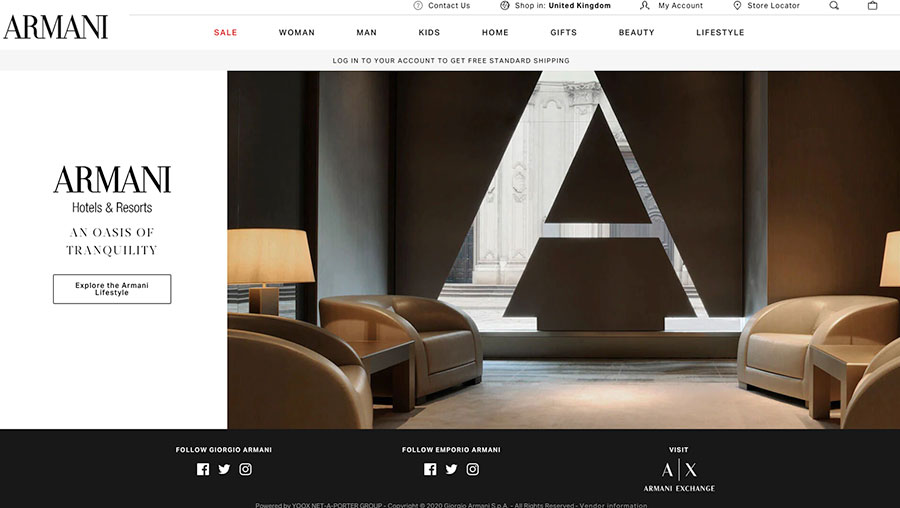


Examples (clockwise from top left) 1. Armani 2. Eric Carle 3. Perpetual Motion Adventures 4. Spencer Peterman
11. PAGE LOAD SPEED & LAZY LOADING
This part of web design has always been an interesting dance. We all know that one of the most important things in web design is a fast loading time. No one has the patience to wait for anything anymore, let alone a website to load.
Page load speed also plays a role in your search engine optimization. Google definitely rewards sites that load quickly. And beyond that, a fast-loading site is a much better user experience for your website visitor. So if you want your site to rank in Google and be indexed as well as possible, a fast-loading website is just as important as a beautiful site with great content that is using all the best SEO practices.
This is where the dance comes in: we want to have websites with big, beautiful images and other multimedia elements but we also need the site to load quickly. We can help you with this choreography and help you design and build a beautiful website, and we can also make sure that it loads as quickly as possible.
If someone waits for your site to load and it’s slow, they will most likely leave. And if they leave, they will probably never come back. This is an example of one of the web design trends that cross over into multiple categories, like web development best practices and search engine optimizagion.
12. ELEGANT SERIF FONTS
Serif fonts seem to add a little class to anything they touch. For years designers have been incorporating standard serif fonts into their designs, but now we are seeing a new trend with serif fonts. We are seeing decorated heavier variations of these classic fonts. A modern take on this tried and true classic.
While some serif fonts can feel a little dated and stodgy, we are looking at more modern elegant serifs to make a statement in 2021.


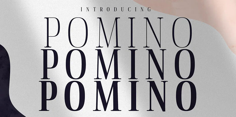

Examples: 1. Washington 2. Quixote 3. Kenfolg 4. Legalitere 5. Pomino 6. Anko
13. BOLD COLOR COMBINATIONS
We wrote earlier in this article about light and muted colors. Now we’re going to switch gears to a bit of a counter trend, bold and interesting color combinations. Even with muted color palettes showing up more and more this year, there is plenty of room to see wild and experimental color combinations. Big, bold, bright colors working side-by-side and muted pallets in interesting combinations.
We believe we’re going to see more of both. We’ll probably even see both incorporated into the same designs.


Examples (clockwise from top left) 1. Panic Studio 2. Mello Studio 3. Fillet 4. Fotonaut
14. BLACK AND WHITE ILLUSTRATIONS
We mentioned illustrations earlier in this article. Now let’s get a little specific and talk about black-and-white illustrations.
We’re not going to hold to literally black-and-white, but rather to a simpler illustration concept. We are seeing big brands like Mailchimp use textured black-and-white illustrations on their site to highlight their services. These designs harken back to an old-school comic or flyer design.
We approve and look forward to seeing more.
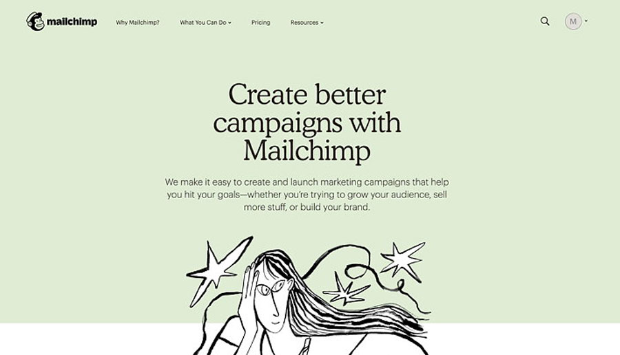


Examples (clockwise from top left) 1. Mailchimp 2. Hello Monday 3. Snap Sound 4. Grafil
15. MOBILE-FIRST DESIGN
Our iPhones and other handheld devices changed the way we see and use the web.
Mobile and handheld devices taught us how to scroll. They taught us that blocks of content should probably just take up one screen at a time. They have shaped the way we browse and the way we experience the internet.
We are always very conscious of how our websites will appear on mobile. This is one of those web design trends that is a long time coming. We think we will see more web designers designing for mobile and handhelds first. Statistics show that over 50% of all the web browsing, world wide, is done using mobile devices. This alone shows the importance of a strong mobile-first design.
In 2021 there is no way that it is acceptable for any site to have a sloppy mobile design.
That’s why we start with mobile-first.

Example: Commonwealth Felt
16. TEXT-ONLY HERO IMAGES
Print media often helps fire up some web design trends and this is no exception. Newspapers do it every day: they put big, bold headlines and their most important content “above the fold”. On the website, this would be called the hero section. It is the very first thing people see when they get to your site or a new page.
What we’re seeing in this trend is designers scrapping the background image and just using eye-catching colors and a bold or unique font to catch visitors’ attention.
Many designers (and clients) are a bit wary of text-only blocks. Images are an easy way to fill the space. We feel that more and more business websites will choose to use big, bold text-only hero sections in 2021.


Examples (clockwise from top left) 1. Tommy 2. Open Web 3. Okb Interactive 4. SOUFFL
17. GRADIENTS
Gradients aren’t new but they are certainly growing in popularity. When Instagram unveiled a new logo in the spring of 2016, the entire Instagram world was in chaos. In a blog post on Medium, Instagram’s Head of Design Ian Spalter said about the redesign, “While the icon is a colorful doorway into the Instagram app, once inside the app, we believe the color should come directly from the community’s photos and videos,” he said.
Instagram’s gradient might have caused a stir in 2016, but now gradients are becoming more and more popular as a way to use color on websites.
Gradients are very versatile. They can be bold or subtle, they can be the main ingredient in your design or just a nice side dish. Because you can use any colors you want, these blends create completely new color combos that feel different and new and modern. Gradients can give your design a very unique vibe.
Gradients can add to a web design, create interesting textures and bring a whole new feeling as overlays on images.
We think we are going to see more and more gradients used in more and more interesting ways on websites in 2021.
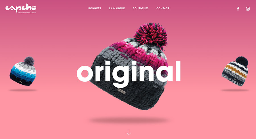


Examples (clockwise from top left) 1. Capcho Headware 2. Impossible is Inevitable 3. Playup 4. Zoocha
If you want to play around with creating your own gradients, check out the website ColorSpace. https://mycolor.space/gradient
18. BIG, BOLD FONTS
Big, bold fonts are one of the web design trends that we love! This trend takes us back up to the text-only hero sections. Big headlines and both fonts are new, but they are getting popular again.
Big text attracts attention. As our eyes dart around the webpage, we will always read the big headlines first. We love cool typography. This is a trend we can get behind.


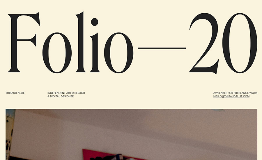
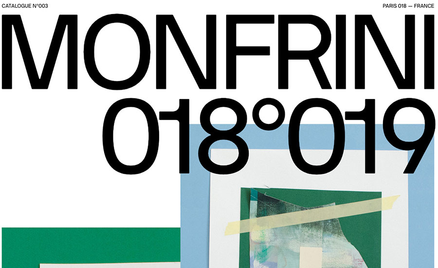
Examples (clockwise from top left) 1. Culture.pl 2. iWeigh 3. Thibaud Allie 4. Florian Monfrini
Wrapping it all up
Sure, we think that better design leads to better conversions. But there is more to the story. We think that these web design trends in line for 2021 are really about finding new and updated ways to add to a website user’s experience. When it comes down to it, especially over the last year, we are spending a lot of time in front of our screens. This year the biggest trend might be to make sure we are providing our website visitors with the best experience possible. We believe this will lead to more conversions and more happy customers.
Stay tuned for a series of articles about other trends that we think are going to be awesome in 2021.
Cider House Media has been selected as one of the top Web Design Companies In Massachusetts by Designrush